03/02/2025 - 17/02/2025 (week 1-week 3)
Angelique Svetlana Pekasa (0377365)
Design Principles GCD60804 / Bachelors Of Creative Media / Taylor's University
Task 1: Exploration
Table of contents
Instructions
Lectures
1. Gestalt theory
Gestalt theory is a theory on how our eyes naturally sees visual elements as a whole instead of separately. This theory is divided into principles:
- Similarity: Elements that are similar in shape to each other are grouped as a one.
- Continuation: Lines and curves within a design makes a path in which the eyes naturally follows through.
- Closure: The eyes fills up missing information within a design as it favors completed shapes.
- Proximity: Visual elements placed closed together should be related and contain the same goal. Those elements that don't relate to one another should be spaced seperatedly.
- Figure/Ground: Visual elements are categorized as either background or foreground.
- Symmetry/Order: Elements that are symmetrical are perceived or grouped as a whole.
For example Fig 1.1 uses gestalt theory as it uses the law of closure as our eyes fills in the blank that she is hugging another person, although the figure isn't actually there.

Fig 1.1 Gestalt theory example, (Week 1, 07/02/2024)
2. Contrast
Contrast are the comparison between objects which opposes each other. This could be in terms of color, shape, and movement that differ from each other. Contrast is used to highlight and make visual interest to the key component in the design
- For example, Fig 1.2 shows contrast in color which highlights the silhouette of both character and also shows good vs evil.

Fig. 1.2, contrast example, (07/02/2025)
3. Emphasis
Emphasis is used to create dominance and highlight towards one object, this could be made by using different shapes, color, or value.
- For example, Fig 1.3 shows dominance/emphasis by using bright colors while the surroundings are black and white.

Fig 1.3 Emphasis example, (Week 1, 07/02/2024)
4. Balance
The delivery of visual component within a design in order to reach equilibrium. It could be achieved in various ways shown below.
- Symmetrical balance are when the design or visual elements are spread equally where bilateral balance is achieved either vertically or horizontally

Fig 1.4 Symmetry example, (Week 1, 07/02/2024)
- Asymmetrical balance is when a composition contains a dominant side which creates unequal distribution of weight, this makes the design more unique and dynamic.

Fig 1.5 asymmetry example, (Week 1, 07/02/2024)
- The Golden Ratio is a mathematical concept that is found through out nature, this could be use as a guideline in designs to create balance as over the centuries it have been represented as perfect beauty.
- In the fig 1.6 below the shape of the cat follows the golden ratio.

Fig 1.6 asymmetry example, (Week 1, 07/02/2024)
- Rule of thirds a guideline in which the image is divided into 3 even spaces both vertically and horizontally to create a dynamic composition. The main object of the image could be place on the intersection of this lines or along one of the lines.
- In fig 1.7 the main object is placed on the point of intersection.

Fig 1.7 rule of thirds example, (Week 1, 07/02/2024)
5. Repetition
Repeating elements in the design order to create rhythm, which makes it looks active. However when doing so, variety should be added to keep the design active and avoid monotony.
- For example, fig 1.8 contains repeated silhouette, however there is variety in it as it uses the silhouette of different people and use different colors to differentiate one another.

Fig 1.8, Repetition example, (Week 1, 07/02/2024)
6. Movement
The war in which a design guides the eyes towards a path by using elements such as lines, shapes, forms, and curves. It occurs when these the objects seems to be moving.
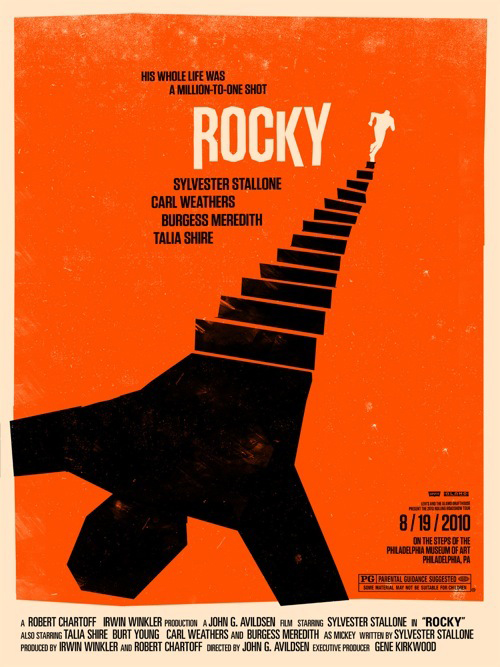
- For example, fig 1.9 shows movement as our eyes follows the path of stairs leading towards a person on it which also leads to the title besides it.

Fig 1.9 Movement example, (Week 1, 07/02/2024)
7. Hierarchy
When the poster makes the most important information their priority, so it is designed to navigate the viewer's eyes into that information.
- For example, in fig 1.10 our eyes will read the name of the band first as it have the largest font and then the date as it is right below it, lastly the location.

Fig 1.10 Hierarchy example, (Week 1, 07/02/2024)
8. Harmony & Unity
Harmony
Harmony is how a design have a sense of unity, how elements fit together to form the same style or aesthetic. However in harmony there should be variety, which is a small change made in the design in order for it not to be dull or boring.
- For example, Fig 1.11 contains different elements, however it share a common trait (color). Which creates a sense of harmony, it also contains variety as there are a different kinds of object placed there.

Fig 1.11 Harmony example, (Week 2, 11/02/2024)
Unity
Unity is how elements are repeated in order to create a sense of oneness, and to point or guide or eyes towards the main object.
- For example, Fig 1.12 shows unity as there are flowers are placed repeatedly next to each other and slightly angled towards the center in order to point our eyes towards the baby, which is the main object.

Fig 1.11 Unity example, (Week 2, 11/02/2024)
9. Symbol
Symbol is a sign or mark used to represent something such as a process, information, or an object. It even can go as far as representing a story. Graphic symbols could be divided into 3 categories:
- Pictorial symbols, means symbols that are made by simplifying the pictures. For example the symbol in Fig 1.12 shows the simplified process of acid rain.

Fig 1.12 Pictorial symbol example, (Week 2, 11/02/2024)
- Abstract symbols, means symbol that are made to look like an object with less details. For example in Fig 1.13, the camera icon in our phone is a simplification of an actual camera.

- Arbitrary symbols, means symbols that have doesn't resemble a particular object or picture, humans learn to understand that symbol overtime. For example, in Fig 1.15 the symbol for USB doesn't resemble anything but we learn what it meant overtime.
Fig 1.14 Arbitrary symbol example, (Week 2, 11/02/2024)
Source: https://www.vectorstock.com/royalty-free-vector/usb-symbol-icon-isolated-flat-design-vector-25035776
10. Word and Image
It is important to choose the suitable word and image that goes together to convey a message. The right fonts and typeface should also be use to deepened the meaning.
- For example in Fig 1.15 a chilling picture of a ghost could be seen. On top of that a spaced out font placed in the middle of the poster creates a more haunting effect.

Fig 1.15 Word and Image example, (Week 2, 11/02/2024
Task 1: Exploration
Selected Design

Memento Movie poster
Artist: Newmarket Films
Year: 2000
Medium: Digital print
Size: 27" x 39.5"
Source: https://www.amazon.co.uk/MEMENTO-POSTER-APPROX-12X8-INCHES/dp/B00FPJ7ZGS
I choose this poster because it really interests me on how they design it to market the movie. This poster uses polaroid, which is a major object used in the movie, for me this feels like a unique take on posters made for movies. The use of polaroids in it seems like a foreshadowing on what to come and expect from the movie. I also like that this poster perfectly give out the theme or the essence of mystery just by looking at it at first glance. I like how the protagonist’s face creates tense, which is also emphasized by the typography they used for the title.
Not only that, this poster also uses several design principles. Below are the deign principles that I could disect:
- Repetition: the poster repeats a polaroid picture, however it doesn't forget to use variety in it, as it switches between 2 different pictures every time.
- Word and image: the poster contains images of the movie and combined with the unique font for the title "Memento" it sets a mystery/thriller tone.
- Rule of thirds: when the poster is divided into 3 equal spaces both horizontally and vertically the main image is set at the top left intersection of the grid.
- Hierarchy: the movie title (most important message) have the largest font as it is the first thing people see. After that people will see the secondary information which is the list of main actors and actress on top of it.
Overall, the poster itself is unique and when it is broken down at a deeper level, it have a lot of design principles engraved to it, that helps in making the poster interesting at first glance.
Feedback
Week 1: Introduction to the module (no feedbacks are given)
Week 2:
Don't uses simplified pictures for examples, use real life example and real hands on examples of it. Make the MIB/Instructions on top of the blog.
Week 3:
The picture of the usb symbol in Fig 1.14 is too small, so when it’s clicked the picture become blurred, it’s better to be replaced with a better resolution picture. In addition to that refer the images used with “figures” instead of using the phrase “the picture below”.
Comments
Post a Comment