21.04.2025 - 12.05.2025 / Week 1- Week 4
Angelique Svetlana Pekasa / 0377365
Advanced Typography / Bachelors Of Creative Media / Taylor's University
Task 1: Exercise 1
Table of contents
Lectures
Week 1
Lecture 1: Typographic System
All designs is based on a structural system (Elam, 2007), which consists of
8 variations with endless possibilities. The 8 major variations are:
- Axial: All elements are organized to either the left or the right of a single axis (axis could be bend).
- Radial: All elements are extended from a point of focus.
- Dilatational: All elements expand from a central point in a circular manner. (can be used with Hierarchy)
- Random: Elements appears to have no specific patterns or relationships with each other. (there is method to the chaos created)
- Grid: A system of vertical and horizontal division
- Modular: A series of non-objective elements that are constructed in as a standardized unit.
- Transitional: An informal system of layered banding
- Bilateral: All text is arranged symmetrically on a single axis.

Fig. 1.1, Examples, (week 1, 21/04/2025)

Fig. 1.2, Examples, (week 1, 21/04/2025)
Week 2
Lecture 2: Typographic Composition
- Principle of Design: Emphasis, isolation, repetition, balance (symmetry and asymmetry), alignment, perspective, rhythm, contrast.

Fig. 1.3, Principles of design, (week 2, 01/05/2025)
- Rule of thirds: photographic guide to composition, where it's divided by 3x3 and important information is put in the intersection.

Fig. 1.4, Rule of thirds, (week 2, 01/05/2025)
- Typographical system (grid): Most used system, however it's modular nature allows infinite possibilities of adaptations. People seems to like it as it tends to be more ordered.
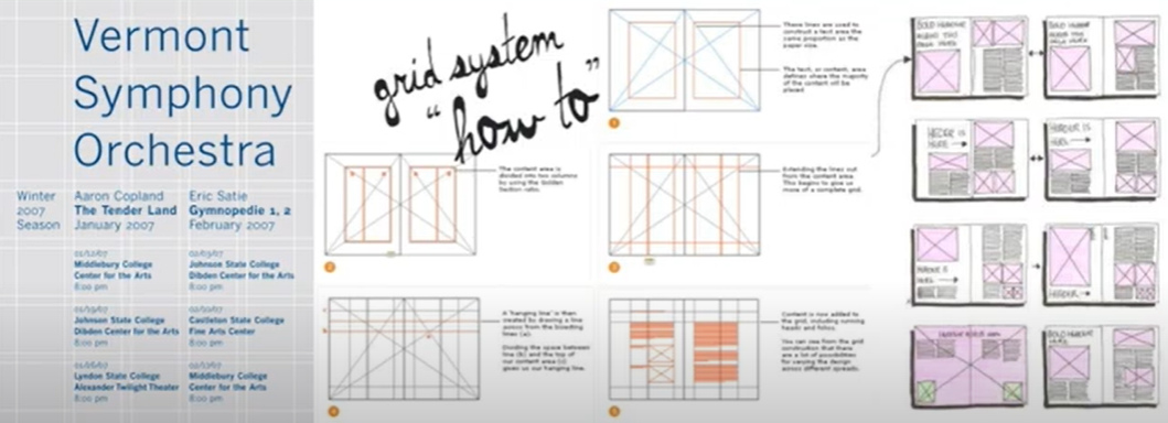
Fig. 1.5, Rule of thirds, (week 2, 01/05/2025)
- Environmental Grid: System that's based of an existing structure or numerous structures combined. Structure is made based on the key features of an environment.

Fig. 1.6, Environmental grid, (week 2, 01/05/2025)
- Form and Movement: Based on exploration of an existing Grid system. made to dispel seriousness of the grid system.

Fig. 1.7, Form and Movement, (week 2, 01/05/2025)
Week 3
Lecture 3: Context & creativity
Handwriting is the first mechanically produced letterforms, and the shape and lines of it is influenced by the tools used to carve them (ex. Sharpened boned)
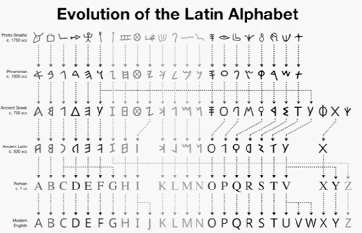
Fig. 1.8, Evolution of Latin Alphabet, (week 3, 07/05/2025)
Evolution of letters:

Fig. 1.9, Evolution of Letters, (week 3, 07/05/2025)
- Cuneiform (3000 B.C.E.) : Earliest system of writing.
- Hieroglyphics (2623-2160 B.C.E.): Writing system fused with the art of relief carving, the first link to a future alphabetic system. Has a lot of potential to be used as ideograms, determinatives, and phonograms.
- Early Greek (5th C. B.C.E.): Contains 22 phonetic alphabet letters. It was then developed by Greeks by adding vowels, however direction of reading isn't fixed.
- Romans Uncials (4th century) : Roman letters become more rounded, with less stroke which makes writing faster.
- English Half Uncials (8th century): Uncial becomes more slanted and condensed in England and Irish.
- Emperor Charlemagne (8C. B.C.E.): Handwriting broke down into diverse regional styles.
- Carolingian Minuscule : The new script that emerged because of standardization as book production increased.
- Black Letter ( 12-15 C. C.E.): refers to Gothic, culminating artistic expression. Pointed arch replaces the round arch of romans.
- The Italian Renaissance: Humanist scholars revives the culture of antiquity, the renaissance embrace ancient Greek and Roman culture through letter form design. The new letterforms was then named Antica.
- Movable Type (11C. - 14C.): Movable type allowed dismantling and resetting of text. Pioneered in China but achieved in Korea.
Evolution of writing system in Asia:

Fig. 1.8, Evolution of Writing system in Asia, (week 3, 07/05/2025)
- Pallava: Oldest writing system used for Sanskrit and Tamil
- Pra-nagari: Used in India for writing Sanskrit
- Kawi: Indonesia's most important script, based on Nagari (becomes basis for Indonesia and Philippines)
- Ancient Gujerati: Basis of medieval script
- Jawi: Arabic-based alphabet, introduced along with Islam.
Week 4
Lecture 4: Designing Type

Fig. 1.9, Typefaces, (week 4, 15/05/2025)
- Frutiger (by Adrian Frutiger):
- Purpose: made to be a new clean, distinctive, and legible typeface that could be seen easily from both closeup and far away.
- Consideration: needs to be recognized even in poor light conditions or at a glance.
- Verdana (by Matthew Carter):
- Purpose: to be legible even on small screen sizes
- Consideration: characteristics of fonts are derived from pixels, therefore lowercase letters such as "i", " j", and "l" are commonly confused.
- Johnston Sans (by Edward Johnston):
- Purpose: to create a new typeface for London's underground railway.
General Process of Type Design
- Research: Understand type history, type anatomy, type conventions, terminologies side-bearings, metrics, and hinting.
- Sketching: This could be done both digitally or traditionally.
- Digitalization: Using professional software such as FontLab and Glyphs. Attention should be paid towards the readability.
- Testing: Process of refining and correcting aspects of the typeface, leads to important feedback. Readability and legibility becomes an important consideration.
- Deploy: There are always teething problems that comes at this stage, the rigour of testing is important so that the teething issue remain minor.
Typeface Construction
- Roman Capital: Grid consists of a square, where inside it contains a circle touching the lines of the square in 4 places. Within the square also contains a rectangle, 3 quarter the size of square, in the center of the square. Therefore, grids can facilitate the construction of letterforms.

Fig. 1.10, Roman Capital, (week 4, 15/05/2025)
- Construction and Consideration: 26 characters could be divided into groups for capitols and lowercases. Many different forms and constructions must be taken into account when designing a new type. Visual correction should be made to make the overshoot and distance needed between the letters.

Fig. 1.10, Classification, (week 4, 15/05/2025)
- Context and Creativity:
- Intrinsic: Designer have an inexplicable need driven by interest to design a typeface, or identify a problem with current ones, thus endeavors to solve it by designing a typeface.
- Extrinsic: Designer is commissioned or student-designer is given a task to design a typeface.
Instructions
Task 1: Exercise 1
For this task we were assigned to make 8 typographical poster using the 8 typographical system. We were told to use one of the 3 text given for the poster, and for this task I chose the text below.
The Design School,
Taylor’s University
Taylor’s University
Russian Constructivism and Graphic Design
Open Public Lectures:
June 24, 2021
Lew Pik Svonn, 9AM-10AM
Ezrena Mohd., 10AM-11AM
Suzy Sulaiman, 11AM-12PM
June 25, 2021
Lim Whay Yin, 9AM-10AM
Fahmi Reza, 10AM-11AM
Manish Acharia, 11AM-12PM
Lecture Theatre 12
For the research I went into google to find out more about the typographical system and understand on how to use it. When researching I stumbled upon this website https://type365.com/2017/02/21/7-typographic-layout-systems/ which opens my mind on how I could play around with all the systems correctly.

Fig. 2.1, Research, (week 1, 24/04/2025)
To get an idea for what I'm about to do I did some rough sketches on paper.
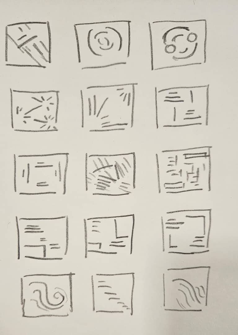
Fig. 2.2, Sketches, (week 1, 24/04/2025)
For this task I decided to use Futura Std on all of the 8 typographical system.
Axial
For Axial, I tried to have fun with the characters and stretch it (shown on Fig 2.2).

Fig. 2.3, Axial attempt 1 & 2, (week 1, 24/04/2025)
However it seems like something is missing, so to add more dynamic in it I tilt the axis and change the layout a bit (shown on Fig 2.2). On Attempt 4 (Fig 2.2) I also added several lines to increase the aesthetics.


Fig. 2.4, Axial attempt 3 & 4, (week 1, 24/04/2025)
After receiving feedback from week 1, I realized that my axial system have too much axis, there should only be one axis. So I redo my work and below (Fig 2.4) is the final one.

Fig. 2.5, Axial attempt 5, (week 1, 24/04/2025)
Dilatational
For Dilatation I wanted to make The outer circle the most important information, and going inwards the importance of the information given decrease. I tried making it on attempt 1 & 2 however using the current layout it seems like the whole layout resembles a face.

Fig. 2.6, Dilatational attempt 1 & 2, (week 1, 24/04/2025)
Because of that, I changed the layout of the inner information and make it entangled with each other to make it interesting.


Fig. 2.7, Dilatational attempt 3, (week 1, 24/04/2025)
Radial
For my 1st attempt (shown on fig ) I tried to make a couple of center points, however it makes the layout looks very messy and chaotic.

Fig. 2.8, Radial attempt 1, (week 1, 25/04/2025)
So, I changed the layout and make only 2 center points located on the top right and bottom left corner. This changes the visuals of it drastically.


Fig. 2.9, Radial attempt 2, (week 1, 25/04/2025)
Bilateral
For bilateral, I wanted to use 2 groups instead of 1 to make it more interesting.


Fig. 2.10, Bilateral attempt 1 & 2, (week 1, 25/04/2025)

Fig. 2.11, Bilateral attempt 3, (week 1, 25/04/2025)
Random
For my 1st and 2nd attempt I tried to make the layout to look somewhat like an arrow. I also tried to play with repetition. However the final deign just looked a bit too messy. So I redo my layout.


Fig. 2.12, Random attempt 1 & 2, (week 1, 26/04/2025)
I still wanted the word "constructivism" to be diverse however I want to put in some order into the layout. I also still use repetition on the top left and bottom right corners which I think makes the layout interesting.


Fig. 2.13, Random attempt 3, (week 1, 26/04/2025)
After the feedback session, Sir. Vinod told me that there was too much order in it. It needs to be more chaotic. So I revised it, and below is the final layout.

Fig. 2.14, Random attempt 3, (week 1, 26/04/2025)
Grid
For the grid system, I was confused as there was much negative space made. So to combat this I inserted orange boxes into the layout.


Fig. 2.15, Grid attempt 1 & 2, (week 1, 27/04/2025)
After feedback I realized I have a small mistake on the title as it exceeds the width between the grids, so I made the title smaller in order for it to fit within it.

Fig. 2.16, Grid attempt 3, (week 1, 27/04/2025)
Modular
It was quite challenging for me to come up with the layout for the modular system. I decided on creating guides of 3 columns and 4 rows.

Fig. 2.17, Modular attempt 1, (week 1, 27/04/2025)
After receiving feedback, I make sure that my layout stays within the grid box. And deleted the lines as it doesn't actually stay within one box. I also redo the entire layout as I wasn't satisfied with it.

Fig. 2.18, Modular attempt 2, (week 1, 27/04/2025)
Transitional
For transitional, attempt 1, I wanted to make my text resemble a staircase that falls and get smaller and smaller as it goes to the bottom. However I wanted to make things more interesting so on attempt 2, I try to make the layout to look like a wave. And I ended up liking it better.

Fig. 2.19, Transition attempt 1 & 2, (week 1, 28/04/2025)
Exercise 1 Final submission (JPEG)

Fig. 2.20, Bilateral Final (week 1, 28/04/2025)

Fig. 2.21, Dilatation Final (week 1, 28/04/2025)

Fig. 2.22, Grid Final (week 1, 28/04/2025)

Fig. 2.23, Modular Final (week 1, 28/04/2025)

Fig. 2.24, Radial Final (week 1, 28/04/2025)

Fig. 2.24, Random Final (week 1, 28/04/2025)

Fig. 2.25, Transitional Final (week 1, 28/04/2025)

Fig. 2.26, Axial Final (week 1, 28/04/2025)

Fig. 2.27, 4x2 Final (week 1, 28/04/2025)
Final submission (PDF)
Fig. 2.27, Final submission with grid (week 1, 28/04/2025)
Fig. 2.27, Final submission without grid (week 1, 28/04/2025)
Exercise 2A
First I went to Pinterest in order to find the right image and I decided to go with the one shown below on Fig 3.1.
Fig. 3.1, Image chosen, (week 2, 04/05/2025)
Image source: https://id.pinterest.com/pin/999517711093053941/
Then I went to illustrator in order to extract the letters from the image. Shown Below is the process on how I do so.

Fig. 3.2,Process work, (week 2, 04/04/2025)
After that I began searched for a similar font and decided that the font "Comic sans" fits best. Then I began to arrange the letters, on the last attempt I decided to used the main stroke of "K" and applied it into B and R to get a consistency, I also increase the width of "K" and "E" so it matches with the rest.


Fig. 3.4, Facebook submission, (week 2, 04/04/2025)
After week 3's feedback, I improved my work. I added more branches so that it looks like the original picture and make sure that the letter doesn't have a sharp turn as branches don't have them. Below is the process.


Fig. 3.6, Final work , (week 1, 07/04/2025)
Exercise 2B
For this exercise we were told to make a movie poster based on the letters that we extracted. To start of this task, I searched on google to find some inspiration and reference. I decided to make a horror looking movie poster. Below are the reference I used along with the credits.
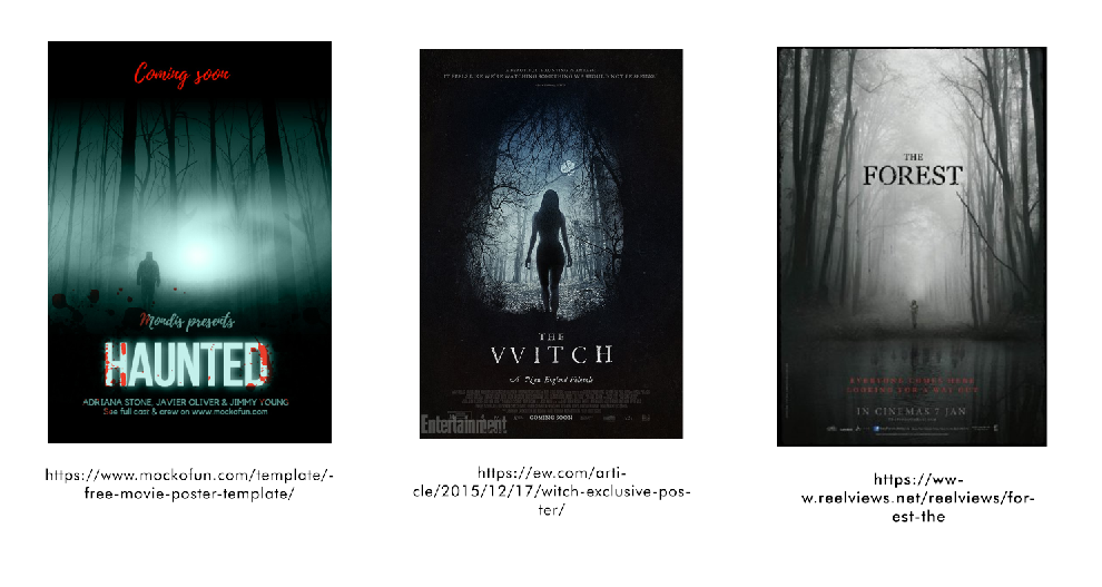
Fig. 4.1, Poster references , (week 3, 10/04/2025)

Fig. 4.2, Images used , (week 3, 10/04/2025)
After that I began to start the poster making process on photoshop.

Fig. 4.3, Process work , (week 3, 10/04/2025)

Fig. 4.4, Final Outcome , (week 3, 10/04/2025)
Exercise 2A and 2B Final Submission

Fig. 4.5, Final Image and Extraction, (week 3, 10/04/2025)

Fig. 4.6, Overall process work, (week 3, 10/04/2025)

Fig. 4.7, Extracted Letterforms (baseline), (week 3, 10/04/2025)

Fig. 4.8, Reference font, (week 3, 10/04/2025)

Fig. 4.9, Final Letterform, (week 3, 10/04/2025)

Fig. 4.10, Extracted Letterforms (top) and Final letterforms (bottom) comparison , (week 3, 10/04/2025)
Fig. 4.11, Final Submission PDF, (week 3, 10/04/2025)
Fig. 4.12, Final Poster JPEG, (week 3, 10/04/2025)
Fig. 4.13, Final submission PDF, (week 3, 10/04/2025)
Feedback
Week 4:
- General feedback: Information should be readable, as it is not supposed to be decorative. should be functional. Set margins and grids beforehand.
- Specific feedback: Good job, can be submitted.
Week 3:
- General feedback: The final work should represent the chosen picture. The font used as a reference should not be decorative. There should be consistency between height and width.
- Specific feedback: The branches doesn't have a complete sharp turn, consider the angle, don't make it sharp. When branch comes together it becomes bigger, so that could be incorporated to the letter. Could add small branches comes out of the main stem, Make the stems consistent.
Week 2:
- General feedback: Avoid extreme angles, when doing axial. Constant readjusting breaks reading rhythm. Set margins, as margins are important to give it style and authentic look. A good design must command the space, there's something that anchors the design to that space. Keep in mind of intervals in grid system
- Specific feedback: Axial should be a single axis. The bilateral is wrong as it have 2 axis therefore it is multilateral, not bilateral. Random need more chaos, there is too much order, not enough chaos. And for modular, make sure that it is within the space boxes, and it could be moved throughout the layout. When doing grid, remember the width between the grids.
- First week of the semester, no feedback given. A brief introduction of the task was given instead.
Reflections
Experience
In the first week, I was very much overwhelmed on the task given. It felt like on semester 1 we were given more time, about 2-3 weeks to finish one task, while this time we were given only 1 week to do the same amount of work load. However I managed to use my time wisely as time management is one of the most crucial thing we need to learn as a designer.
Observation
Within this 4 weeks, I observed how being detailed is very important and crucial. On week 3's feedback I learned that I really need to observe the structure of the branches and how it bends to extract the letters. And when I add those details it actually change the outcome greatly, the outcome becomes more alive and lively, in addition to that it also resembles the initial picture by a lot, compared to the one beforehand.
Findings
During these few weeks, I find out how we are supposed to take risk on our designs. Taking risk is very important, in order to grow as a designer. In addition to that I also find how, again, typography is complicated. However day by day, week by week, my brain began to get used to it again after a long break from typography.
Further Reading
For further Reading I choose the book: A Type Primer By: John Kane. I choose this as I was skimming through it and saw the Fibonacci Sequence.

Fig. 4.1,Fibonacci Sequence, (week 1, 04/04/2025)
The Fibonacci Sequence or the golden ratio also plays a part in typography to create naturally pleasing visuals. The sequence itself is used in type sizes, spacings, and also page layouts.
The book also talks about the grid system. A grid system contains:

Fig. 4.2,The grid system (Folio), (week 1, 04/04/2025)
- Margins: The area of space in which text can't appear.
- Text space: The area of space in which text could appear.
- Folio: The page number
- Headers: The title
- Field: Basic component of grid, contain active corner (top left) and passive corner (lower right).
- Gutters (vertical and horizontal): The spaces between fields, separates fields from each other.
Comments
Post a Comment