03/03/2025 - 17/04/2025 (week 5-week 7)
Angelique Svetlana Pekasa (0377365)
Design Principles GCD60804 / Bachelors Of Creative Media / Taylor's University
Task 1: Exploration
Table of contents
Instructions
Lecture
No lecture was given
Task 3: Development & Design
Brief recap task 3:
Select one of the 3 sketches made in the previous task and develop it. Develop it through color exploration, composition, typeface, positioning, etc., with design principles in mind.
- Create your final design in A4 size, JPEG format in at least 300dpi.
- Write a 200-word rationale explaining/defending:
- the decisions made in your design,
- the meaning/purpose of the design
- the design principles that are employed to create the design
Selected sketch:
Fig 1.1, Sketch 2, (22/02/2025)
Development:
- Position and composition:
In order to develop the sketch further, I changed it's positioning and composition. At first (Fig 1.2) I tried to entirely reposition and recompose the poster. I also added color to it and texture.
After developing it, I think seems too simple, so I went back to the original sketch and develop it from there. In Fig 1.3, I put a spotlight towards the main character, I did this to put more emphasis towards it by adding additional backgrounds and blurring out unnecessary information which also acts as a foreshadow for the movie.
Fig 1.3, Development, (week 5, 07/03/2025)
- Coloring:
For the color I wanted the poster to have a brownish color palette as it was the main characters' choice of clothing. In addition to that I wanted to make the huge polaroid brown in order to give effect that the polaroid is damaged. The bits and pieces of polaroids within the main character's image are made into black and white to give an oldish look, and to give variety towards the entire poster.
- Fonts exploration:
Fig 1.8, Typeface exploration, (week 5, 08/03/2025)
In addition to that, I also research on fonts for the list of main actors and actress for the poster. I searched for a handwritten font that looks thin.
Fig 1.9, Typeface exploration, (week 5, 09/03/2025)
From the exploration shown in Fig 1.9, I ended up liking no.5 best. However later on I realized that no 1 is most suitable when I was working on it shown in Fig 2.4.
Design Process:
First, I went to google to find a creative common licensed picture of Guy Pearce (the actor of the movie) to be used. Then I started working on my design process on photoshop. Because the licensed picture was a bit cropped I make use of photoshop's AI generative fill tool.
Fig 2.1, Generative fill tool, (week 6, 13/03/2025)
Fig 2.2, Polaroid effect, (week 6, 13/03/2025)
Fig 2.3, Finishing the main polaroid, (week 6, 14/03/2025)
Fig 2.4, neutral filters, (week 6, 14/03/2025)
Fig 2.5, Finishing, (week 6, 14/03/2025)
I put a lot of thought on week 6 feedback, and tried a couple of different things. I tried to make the poster like the sketch, however I realized that the words on the background of the main polaroid doesn't work that well (Fig 2.6), so I scraped the idea.
Fig 2.6, Scraped idea, (week 6, 14/03/2025)
Fig 2.7, Finishing poster, (week 6, 14/03/2025)
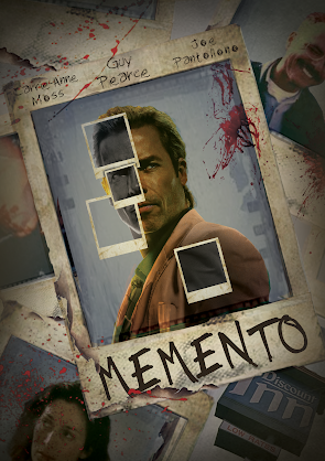
After consultation and some feedback Ms. Jinchi gave on week 7, I readjust my poster to be more centered and decrease the vignette effect. Shown below is the final version after consultation. Shown below on Fig 2.8 is the final poster.
Fig 2.8, Final poster, (week 7, 17/03/2025)
Rationale:
In this design work, I wanted to deliver a mysterious and thrilling vibes of the movie. I wanted to highlight the main character alongside the use of polaroids to foreshadow how significant it is for the movie.
This design is made to replicate the time in the movie which is in the 2000s, which is why I set the tone to yellowish to get that effect. I also made polaroids within the main character black and white as there are story lines in the movie which is set in a black and white tone to differentiate it from the main storyline.
For this design I used a lot of design principles including emphasis, which I used by putting the main character at the center of the poster and adding vignette effect to highlight the main image. I also used repetition, by repetitively using the polaroids, however at the same time, I didn't forget to put variation in it by making the poaroids within the main character black and white to make it interesting.
CREDITS
Texture Credits:
Fig 3.1, Texture credits, (week 6, 15/03/2025)
Picture Credits:
Feedback
Week 5: I was asked to develop the previous sketch first and not jump into photoshop directly. Develop the sketch by changing it's composition, experiment on fonts, and etc. Develop the sketch first to make sure that the best result will be made.
Week 6: Overall good development, as there are many options made and development made. For the entire poster Ms.Jinchi prefered Fig 1.5 to be finalized. In addition to that for the list of main actors/actress I could try to use san serif fonts like arial, as too many hand written fonts might distract the viewers attention. However at the same time san-serif font might not be blend well with others, so it's important to try both of it first. And for the poster I could either photograph a friend or take pictures from google that are already licensed.


Comments
Post a Comment