21.05.2025 - 04.06.2025 / Week 5- Week 7
Angelique Svetlana Pekasa / 0377365
Advanced Typography / Bachelors Of Creative Media / Taylor's University
Task 2: Key Artwork & Collateral
Table of contents
Lectures
Week 5
Lecture 5: Perception and Organization
Perception is how something is interpreted, in typography it deals with
visual navigation and interpretation of the reader via contrast, form and
organization. Contrast is important to create distinction of
information.
Contrast can be divided into 7 types:
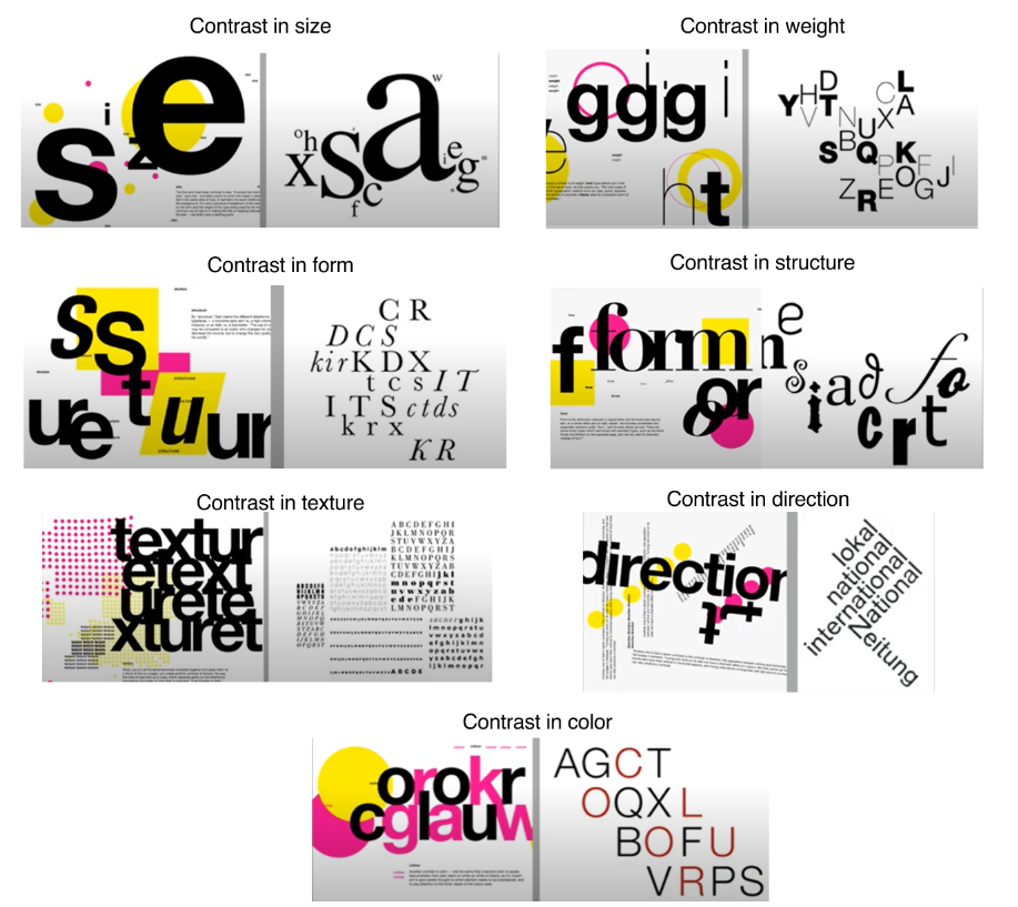
Fig 1.1, Types of contrast, (Week 5 25/05/2025)
- Contrast in Size: Draws the readers attention to a certain point.
- Contrast in Weight: Describes how bold type can stand out against lighter type, helps create powerful point of visual emphasis.
- Contrast in Form: Distinction between capital letter and lowercase letters.
- Contrast in structure: The different letterforms of different kinds of typefaces.
- Contrast in texture: Different contrast of size, weight, form, and structure.
- Contrast in direction: Opposition between vertical and horizontal and utilizing different angles.
- Contrast in color: Highlights information that is in color compared to plain black and white.
Form: The overall look and feel of elements that make up the typographic
composition, it is how the text look as a whole. Form have 2 functions,
to represent a concept and to do so in visual form.
Gestalt theory emphasize how the whole of anything is greater than its
parts. A design should be looked as a whole instead of its parts.
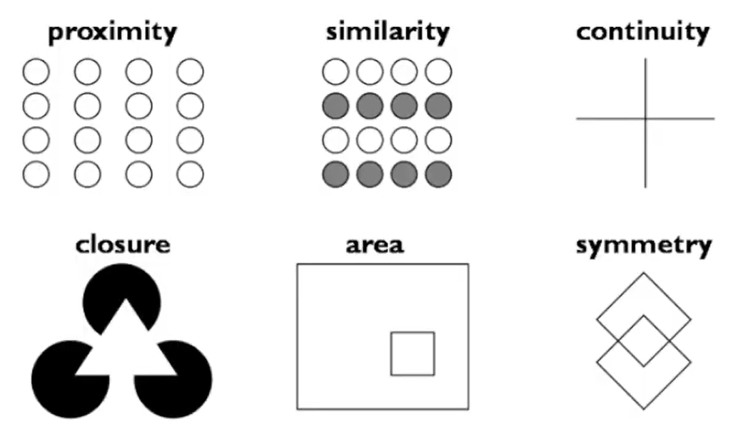
Fig 1.2, Gestalt theory, (Week 5 25/05/2025)
- Law of Similarity: elements similar to each other tends to be seen as a unified group.
- Law of Proximity: elements closed together tends to be seen as a unified group
- Law of Closure: Mind's tendency to see complete forms in incomplete ones.
- Law of Continuation: Mind's tendency to see 2 or more objects as different singular object even when they intersect.
- Law of Symmetry: Mind's tendency to be attracted to something that's balanced.
Instructions
Task 2A: Key Artwork
To start off this task, we were told to make a mind map about ourselves.
This will make us understand ourselves better and therefore make it easier
for use to make a wordmark that could represent ourselves.

Fig 2.1, Mind map, week 4 (18/05/2025)
After that I began to search for inspiration on Pinterest. I decided to go with the word bold and retro-futuristic for the keywords to make my wordmark.

Fig 2.2, Mood board/reference, week 4 (18/05/2025)
After that I began to come up with a sketch, and began to identify what my
collateral will look like if I went in with the sketch I made. for number
1, 3, and 5, I decided to go with just the word bold alone as my keyword,
however for number 2, 4, and 6, I decided to use both keywords.
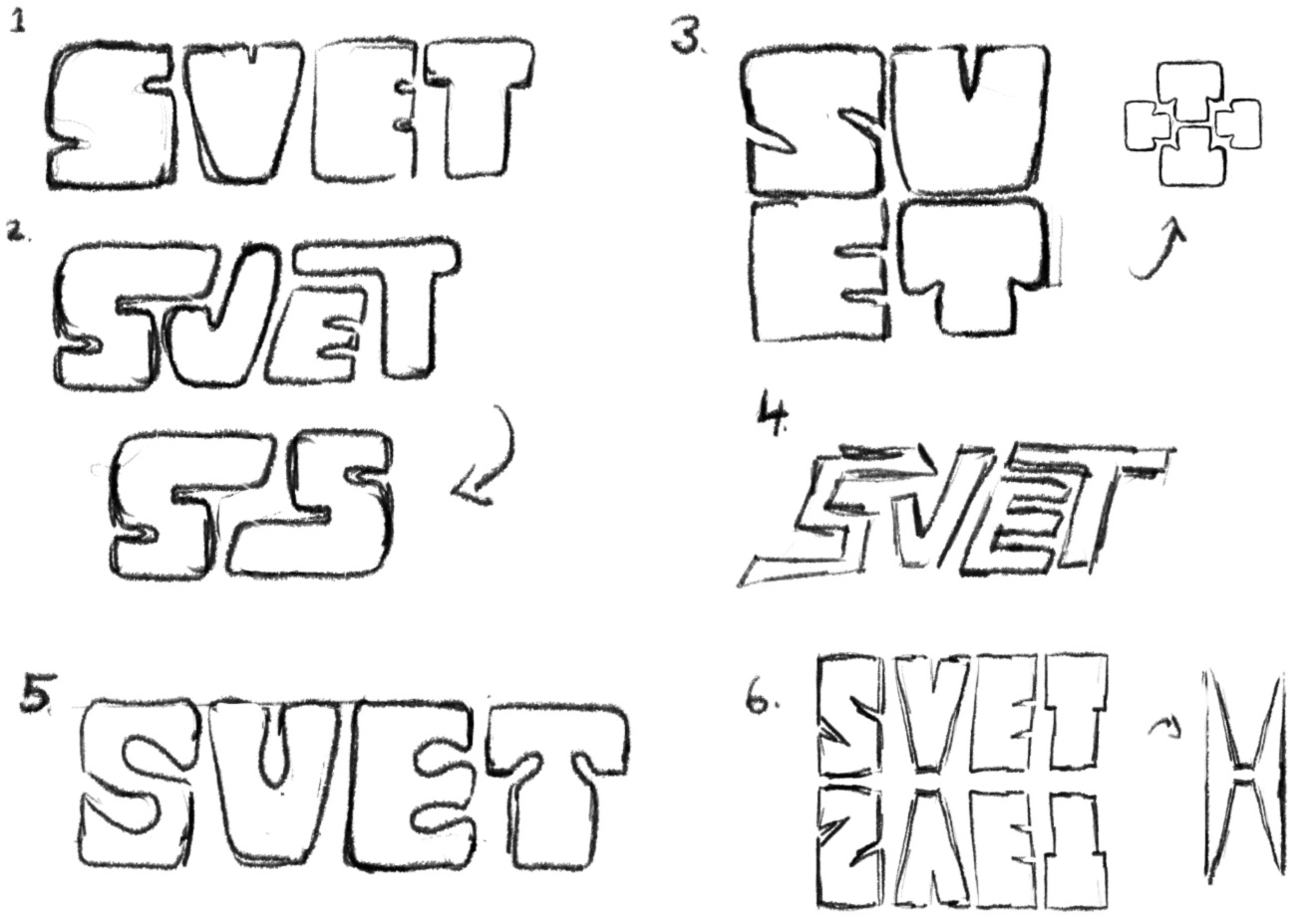
Fig 2.3, Sketches, week 4 (18/05/2025)
I decided that number 2 suits the keyword best so I digitalized it. I
began the digitalization process in Adobe illustrator, I first import
the sketch and trace it. Below is how I do so.

Fig 2.4, Digitalization, week 5 (26/05/2025)
After receiving feedback from Mr. Vinod in week 6, I redo my work.
Shown below is the changes made alongside with the alternatives that I
explored.

Fig 2.5, Digitalization, week 5 (26/05/2025)

Fig 2.6, Final wordmark, week 5 (26/05/2025)
I also searched for a color palette which have a dark shade, 2 light shade, 2 middle shade that's complimentary yet contrasting. Below is the color palette that I chose.

Fig 2.7, Color Palette, week 5 (26/05/2025)
Then I began my animating process, I first import my logo onto adobe after effects. Shown below is the first process on how I made the tracing of my logo.

Fig 2.8, Process work, (week 6, 02/06/2025)
After that I wanted my color of my logo to appear, for this I used radial wipe. Shown below is the process on how I do so.

Fig 2.9, Process work, (week 6, 02/06/2025)
Fig 2.10, Animation, (week 6, 27/05/2025)
Final submission Task 2A
- Black wordmark on white background
- White wordmark on black background
- Colour palette
- Wordmark in actual colours on lightest shade of colour palette
- Wordmark in lightest shade of colour palette on darkest shade of colour palette
- Animation

Fig 2.11, White wordmark on black background, week 5 (26/05/2025)
Fig 2.12, Black wordmark on white background, week 5 (26/05/2025)

Fig 2.13, Color palette, week 5 (26/05/2025)

Fig 2.14, Wordmark in actual colours on lightest shade of colour
palette, week 5 (26/05/2025)

Fig 2.15, Wordmark in lightest shade of colour palette on darkest shade of colour
palette, week 5 (26/05/2025)
Fig 2.16, PDF submission, week 5 (26/05/2025)
.gif)
Fig 2.17, Animation (week 7, 13/05/2025)
Task 2B: Collateral
For the collateral, I made 4 items: stickers, hoodie, skateboard and a tape.
I first work with adobe illustrator in order to make the stickers. Shown
below is how I do so.

Fig 3.1, Sticker collateral process, (week 6, 29/05/2025)

Fig 3.2, Illustrator screengrab, (week 6, 29/05/2025)

Fig 3.3, Decorative post, (week 6, 29/05/2025)

Fig 3.4, Instagram logo, (week 6, 29/05/2025)
Then I searched for mockups on several websites. Below are the websites used:
- https://www.freepik.com/
- https://mrmockup.com/
- https://unblast.com/
- https://mockey.ai/
For the hoodie collateral, I inserted my design onto Mockey.ai's website and then changed the color of it and adjust it further from the website. Below is the imaged made.

Fig 3.3, hoodie collateral, (week 6, 29/05/2025)
For the rest of the collateral, I go to the websites and then downloaded the PSD file and edit it from there, I changed the color of the background so that it matches my color palette.


Fig 3.4, other collaterals, (week 6, 29/05/2025)
Next, I went into photoshop again to make the Instagram post of myself. Shown below on Fig 3.5 is the process of how I do so.
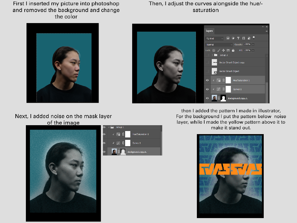
Fig 3.5, Photoshop process, (week 6, 29/05/2025)

Fig 3.6, Self-portrait, (week 6, 29/05/2025)
After that I make the layout of my feeds and upload it into Instagram.

Fig 3.7, Instagram Layout, (week 7, 03/05/2025)

Fig 3.8, Collateral 1, (week 7, 03/05/2025)

Fig 3.9, Collateral 2, (week 7, 03/05/2025)

Fig 3.10, Collateral 3, (week 7, 03/05/2025)
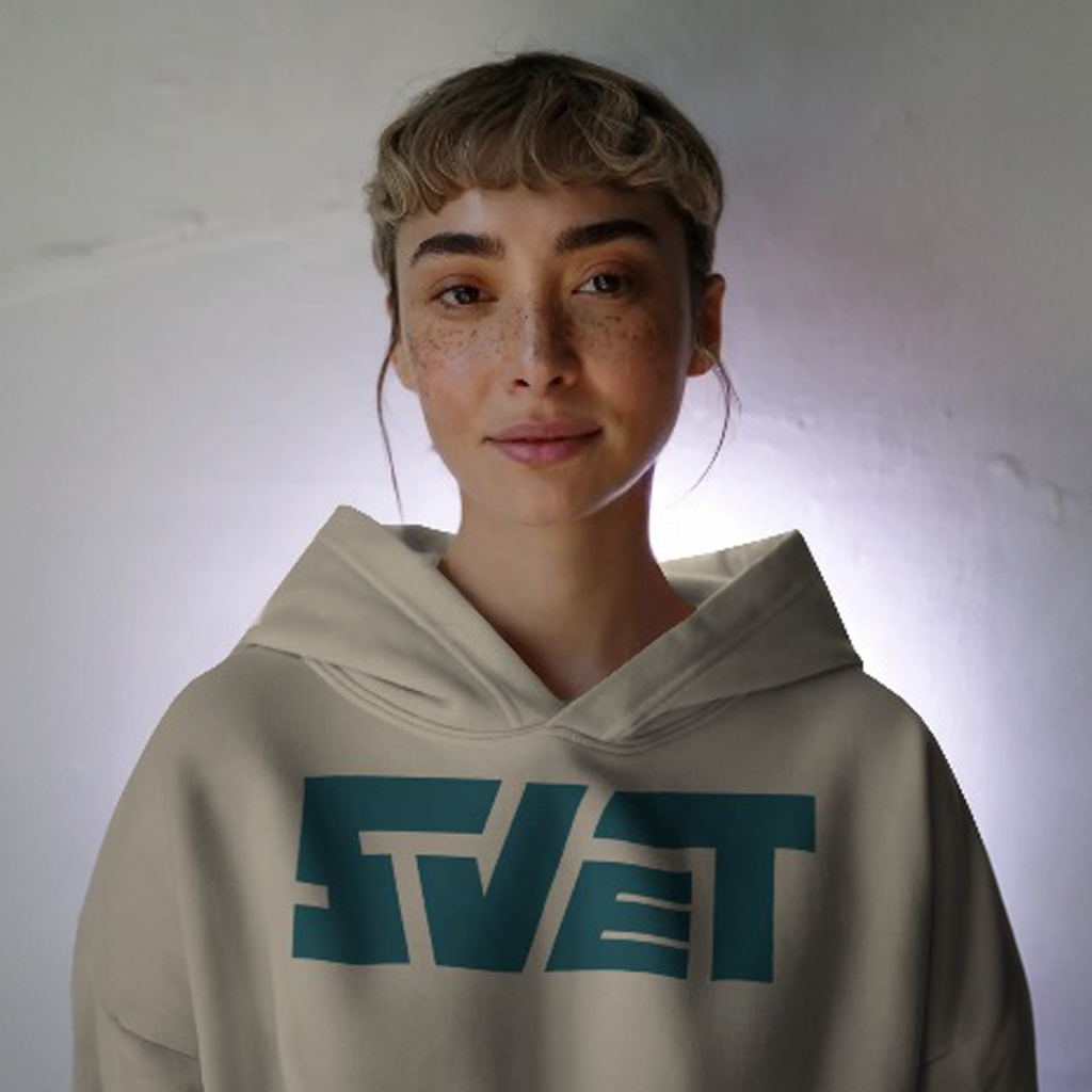
Fig 3.11, Collateral 4, (week 7, 03/05/2025)

Fig 3.12, Decorative post, (week 7, 03/05/2025)

Fig 3.13, Self-portrait post, (week 7, 03/05/2025)
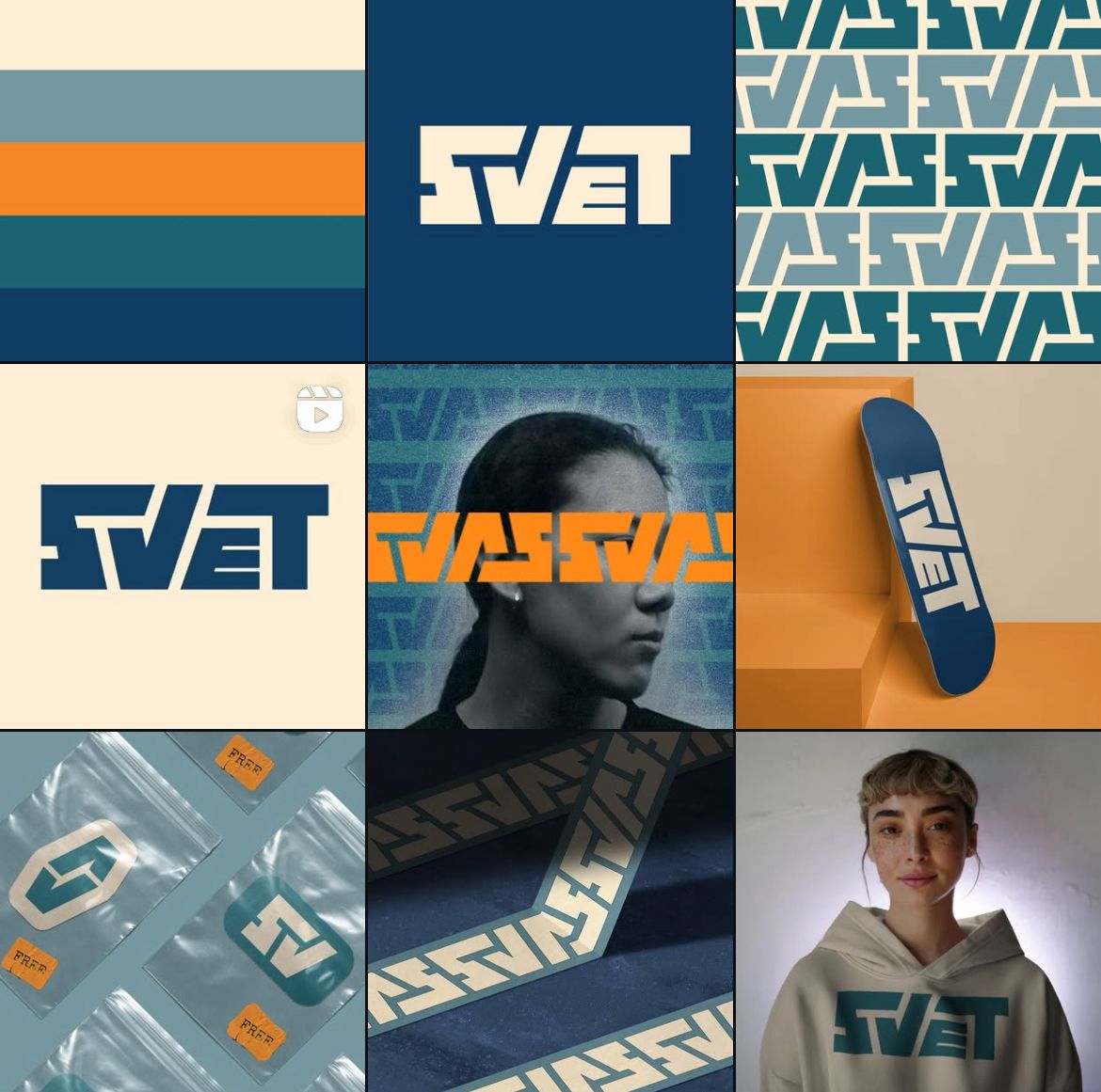
Fig 3.14, Instagram Layout, (week 7, 03/05/2025)
Fig 3.15, Instagram Screengrab, (week 7, 03/05/2025)
Fig 3.16, PDF compilation, (week 7, 03/05/2025)
Final submission Task 2A & 2B
Fig 4.1, White wordmark on black background, week 5 (26/05/2025)
Fig 4.2, Black wordmark on white background, week 5 (26/05/2025)
Fig 4.3, Color palette, week 5 (26/05/2025)
Fig 4.4, Wordmark in actual colours on lightest shade of colour palette, week 5 (26/05/2025)
Fig 4.5, Wordmark in lightest shade of colour palette on darkest shade of colour palette, week 5 (26/05/2025)
Fig 4.6, PDF submission, week 5 (26/05/2025)
Fig 4.7, Animation (week 7, 13/05/2025)
Instagram page: https://www.instagram.com/svet.apparel/
Fig 4.8, Collateral 1, (week 7, 03/05/2025)
Fig 4.9, Collateral 2, (week 7, 03/05/2025)
Fig 4.10, Collateral 3, (week 7, 03/05/2025)
Fig 4.11, Collateral 4, (week 7, 03/05/2025)
Fig 4.12, Decorative post, (week 7, 03/05/2025)
Fig 4.13, Self-portrait post, (week 7, 03/05/2025)
Fig 4.15, Instagram Layout, (week 7, 03/05/2025)
Fig 4.16, Instagram Screengrab, (week 7, 03/05/2025)
Fig 4.17, PDF compilation, (week 7, 03/05/2025)
Feedback
Week 8 :
- General feedback: The portrait should be a professional picture of yourself. The animation should be put into one of the 9 Instagram post.
- Specific feedback: Good work, this could be developed to be a real brand.
Week 7 :
-
General feedback: No general feedback was given.
- Specific feedback: Ok, good.
Week 6 :
-
General feedback: The color palette should have 2 neutral shades, 2 middle color
that's complementary to each other and a dark shade. Keep the wordmark balanced. Make sure to out versions.
- Specific feedback: Don't make the edges round, just make it straight. Make sure that the spaces are consistent, use the grid in
order to do so.
Week 5 :
- General feedback: Imagine it in black and white first, don't need color palette. The mood board can continue to grow. Make sure its a wordmark not a mark.
- Specific feedback: Make sure that the keyword represent the artwork.
Reflections
Experience
This task is very interesting for me, I find it exciting to make my own brand identity using my own name. I have a lot of fun expanding my own wordmark to make other collaterals out of it. It makes me realized how just one idea can lead to a lot more.
Observation
I observed how typography could convey meaning, in this task we were assigned to express ourselves by making a wordmark. However, we couldn't really incorporate graphical elements into it. Doing this task makes me observe just how the rounded, straight, or curves edges gives meaning in a typographical work.
Findings
Doing this task opens my mind and gives me an inside look on branding and making a brand identity. I learned how a color palette should have a complimentary color in order to make in stand out. At first I was hesitant in doing so, however after a bunch of trials and errors I find the right one that makes my Instagram page pops out.
Further Reading
Chosen book: Stop Stealing Sheep, Find out how type Works

Fig 4.1, Stop Stealing Sheep, (Week 8, 16/06/2025)
Chapter 7: How it works
Form follows function, letters are originally invented to make communications easier, to address message without confusion. Different cultures added their own typographical variant.
A typeface should have enough spacing between them when they are in a text. As text might be long and hard to read, enough space should be given to allow readers to finish reading them before they get distracted by others. In addition to that you should adjust the typographic parameters to the situation and condition of the page and the context of it. It is important to look at the spacing and other elements that are inside the page.
Comments
Post a Comment