21.04.2025 - 12.05.2025 / Week 1- Week 4
Angelique Svetlana Pekasa / 0377365
Interactive Design / Bachelors Of Creative Media / Taylor's University
Task 1: Exercise 1
Table of contents
Instructions
Exercises 1
TASK INSTRUSTIONS
Choose FIVE (5) websites from the link given. Review the website that you've selected carefully, taking note of its design, layout, content, and functionality. Identify the strengths and weaknesses of the website, and consider how they impact the user experience. Write a brief report summarizing your findings and recommendations.
What To Have in The Analysis:
Consider the purpose and goals of the website, and evaluate whether they are effectively communicated to the user.
Evaluate the visual design and layout of the website, including its use of color, typography, and imagery. Consider the functionality and usability of the website, including its navigation, forms, and interactive elements. Evaluate the quality and relevance of the website's content, including its accuracy, clarity, and organization. Consider the website's performance, including its load times, responsiveness, and compatibility with different devices and browsers.
Deliverables:
Write a brief report summarizing in not less than 200 words for each website analysis. You can include a screen capture of each section or page of the website to explain. Make sure that the formatting of the report is clear (heading/subheadings)
Shown below are the links given by Sir. Shamsul, each of this sites contains websites which have won/nominated for it best user experiences. Within this links we were task to choose 5 different websites to choose and make an analysis of.
Chosen websites
Visual design & Layout
This is a website for a creative agency called RAYRAY. When opening the website, we were immediately greeted by its company name (the heading) which contains motion graphic that follows the path of the cursor. This is a great way to capture the audience attention.

Fig 1.1, Website Homepage, (Week 1, 23/04/2025)
Purpose and goals
Below the heading, there is a section that contains a flow of words that move from left to right which highlights the services offered, and below that contains a brief summary of who they are and what services they offers.

Fig 1.2, Website Homepage, (Week 1, 23/04/2025)
The website aims to showcase their expertise is also delivered by showcasing their portfolio and when the cursor is hovered towards one of them a short clip of what's within it emerges.

Fig 1.3, Website's Portfolio, (Week 1, 23/04/2025)
Website's performance
The website also performs well when opened in a mobile phone, however it isn't as interactive as it is when it's opened in desktop. Although features are disabled when opened in a mobile phone, the contents of it is still the same, and the purpose and goals of the website is delivered clearly.
Fig 1.4, Website's mobile view, (Week 1, 23/04/2025)
2. Summoner
Visual design & Layout
This is a website for a Co-Creative marketing studio, which they state clearly in the moving headline above its homepage. At first glance the homepage shows their logo, and when the cursor is hovered above it, the name of their studio "Summoner" appears, this makes it interesting. The layout is also simple and easy to understand. The navigation is also straight forward however, it lacks the a sign or phrase that indicate the users to scroll down as there are more below.
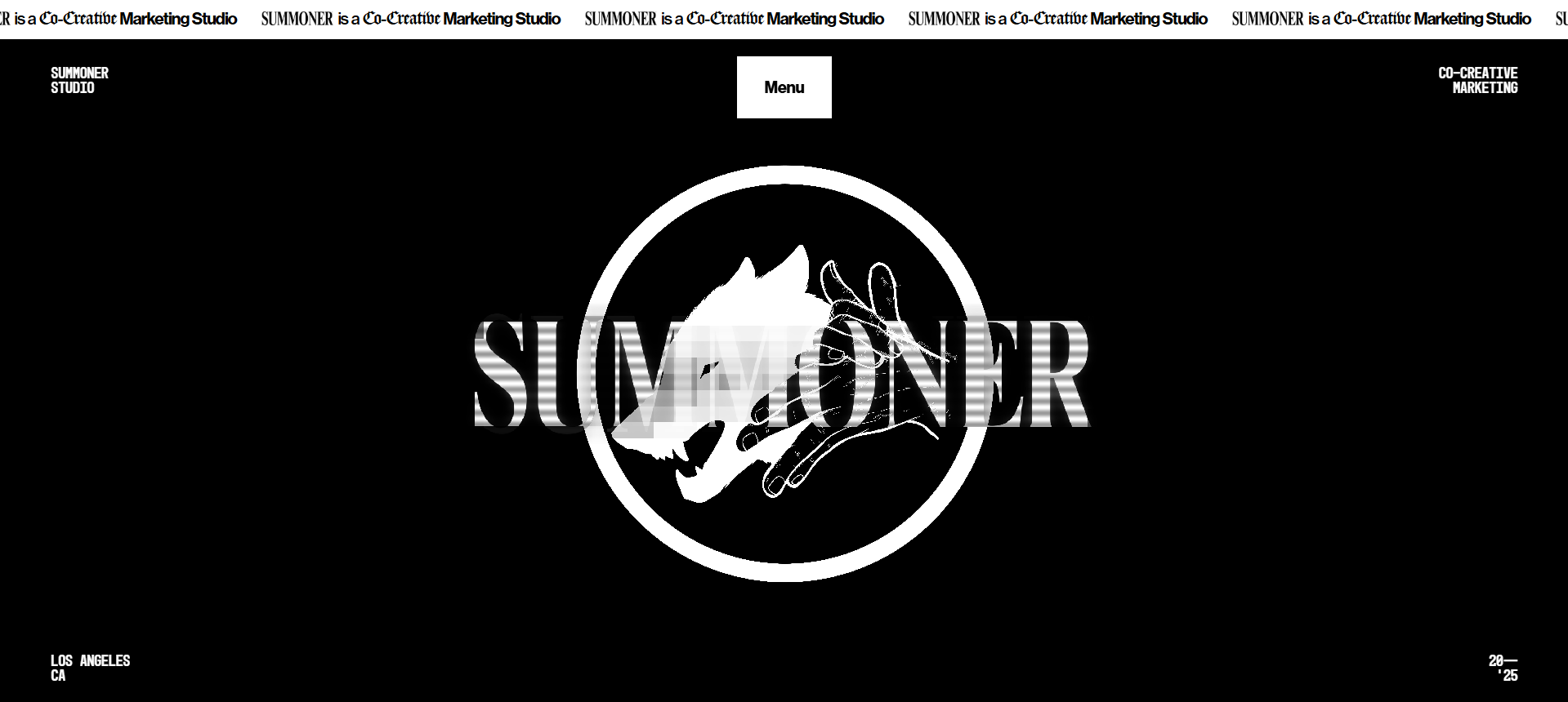
Fig 1.5, Website Homepage, (Week 1, 23/04/2025)
Purpose and goals
The website's goal is to showcase their services and get clients, this is achieved by showcasing their work. The layout of the website might seem simple, but when it's scrolled down videos of their portfolios with great graphics immediately appears leaving the user no choice but to watch it. However, a more detailed explanation of their services might be needed in order to provide deeper insights for the users and attract potential clients.

Fig 1.6, Website's Portfolio, (Week 1, 23/04/2025)
Website's performance
The website loads perfectly and quicky with optimized pictures and videos in both mobile and desktop. The hidden brand name also works well on mobile when its scrolled upon. However, the menu button seems to be disturbing when it is opened on mobile as it covers parts of the website.

Fig 1.7, Website's mobile view, (Week 1, 23/04/2025)
3. Seriti
Visual design & Layout
This is a website for a production company specializing in making commercials. The website's layout is simple, minimalist and straightforward, it isn't overwhelming to see. And when the navigations are clicked, it shows a video transition which catches the user's attention. The layout of the homepage isn't like any other website, the homepage highlights the company's portfolio instead of the company's name, this showcases their works effortlessly. However the website lacks users interactivity which decreases the user experience.

Fig 1.8, Website's Homepage, (Week 1, 23/04/2025)
Purpose and goals
The purpose of this website is to showcase the services they offered, this is delivered smoothly and effortlessly as the design of the website forcefully brings the users attention towards it. The website's homepage contains their works, and when scrolled down more of their works are showcased. When the cursor is hovered above one of their works, others are blurred out to bring the users attention towards the main focus.

Fig 1.9, Website's Portfolio, (Week 1, 23/04/2025)
The website also shows this purpose by providing insights towards their creative team under the "directors" navigation. This helps builds trust towards users.

Fig 1.10, Website's Directors Page, (Week 1, 23/04/2025)
Website's performance
The website works well for both desktop view and mobile view. It also performs well as it loads quickly, in addition to that the video it plays are also optimized. However, some features are erased in the mobile view.

Visual design & Layout
This is a website for a tech venture firm could Topology, the website uses a brutalist-minimalist design with a minimal color palette of black, grey, and white. Although the design is minimalist, it reflects the brand's purpose and goals, and speaks load of the cutting-edge technology it offers. The website uses serif typefaces, which is simple and enhance readability. The navigations are also straightforward and clear. On top of that, the website is highly interactive as there are animations from the homepage that follows as the cursor scrolls downwards. The animation brings the users (literally) into their "about" page as if they are inside the website itself, being immersed in it.

Fig 1.12, Website's Homepage, (Week 1, 23/04/2025)
Purpose and goals
Unlike other websites mentioned above, Topology doesn't sell services, Topology's purpose and goals are to find founders to partner with them, founders that aligns with their vision and mission. Unlike other websites mentioned above, Topology doesn't really highlight their portfolios, instead, the they highlights their brand identity, philosophy, and focus. With the same reason in mind, Topology also have minimal call-to action navigation.

Fig 1.13, Website's Principles, (Week 1, 23/04/2025)
Website's performance
The website performs well on both mobile and desktop, therefore it is accessible and provide a consistent user experience. It also loads almost instantly, with fully optimized animations.

Visual design & Layout
This is a website for a digital art direction, production, and modelling studio called Visualbusiness. The layout of the website is minimalist, and it lacks interactive experience that keeps the users intrigued and engaged, unlike the rest of the websites mentioned above. However, it is unique as it makes use of negative space in a way that catches the users' attention. The website contains straight forward navigation, but again, it lacks interactive experience that guides or leads the users towards these navigations like "works", "models", and "contact", these navigations are also a bit too small to be seen. The typography used is also clean and simple, but it lacks visual hierarchy. On top of that the website lacks transition from one page to another.

Fig 1.15, Website's Homepage, (Week 1, 23/04/2025)
Purpose and goals
The purpose and goals of this website is to showcase their portfolio and services. They showcase their models and photographic works alongside art directions on their homepage and throughout the website, however the website lacks philosophy and therefore lacks brand image.

Fig 1.16, Website's Homepage, (Week 1, 23/04/2025)
Website's performance
The website works well on both desktop and mobile view. However the mobile view lacks of navigation and the white spaces used isn't as creative or doesn't work quite as well as the desktop view. But, the website has fast load times as it contains light assets. On the other hand, the assets might actually be "too light" as the website lacks of interactive elements that leads to a better user experience.

Fig 1.16, Website's Mobile View, (Week 1, 23/04/2025)
Reflections
From doing exercise 1, I have learned that consistency is the key. In most websites the navigation bar will always be at the top right, and because people are already used to it, they could easily search for the navigation bars when needed. I also learned that consistency in users experience are important as users should gain the same amount of experience no matter what platform they used to open the website. On top of that I've learned that websites doesn't use fancy fonts, most fonts used are simple.
Comments
Post a Comment