04.11.2024 - 25.11.2024 / Week 7- Week 9
Angelique Svetlana Pekasa / 0377365
Typography / Bachelors Of Creative Media / Taylor's University
Task 3A: Exercise 1
Table of contents
Lectures
Lecture notes:
Instructions
<iframe src ="https://drive.google.com/file/d/1nsiP1dQjLFJKGnkqo2HBvCvqOUH7po_n/preview" width="640" height="480" allow="autoplay"></iframe>
Task 3: Type Design and Communication
In this task we were assigned to make our own writing style, digitalize it
and then make a final poster with letters and punctuations:
o l e d s n c h t i g , . ! #. Before that we were asked to do a detailed dissection of the letters H
o g b in adobe illustrator.
Research and Ideation
Letter Dissection
For the letter dissection I choose to dissect Serifa Std 55 Roman. After
dissecting the letters below, I learned that there were no perfect circles
used to make curves. To emphasize this I only used circles and lines to
dissect the letters below, so when there are curves present, it could be
seen that there will be a lot of circles in the dissection, as none of it
are made by a perfect one.


Fig 2.1 ( H and o dissection), (week 7, 07/11/2024)


Fig 2.1 ( g and b dissection), (week 7, 07/11/2024)
Sketches
We were assigned to explore at least 3 different writing styles for each
of the 3 different pens. For this exercise I used the broad-edge pen, the flexible pointed pen, and the pointed pen. I tried
to get used to each type of pen and then I explore which writing style
matches the type of pen.

Fig 1.3 (exploration), (week 7, 09/11/2024)
Flexible pointed pen

Fig 1.4 (exploration), (week 7, 09/11/2024)

Fig 1.5 (exploration), (week 7, 09/11/2024)

Fig 1.6 (exploration), (week 7, 09/11/2024)
After a lot of explorations, I decided to use the broad-edged pen and
digitalize number 1, but before that I explored the letters and
punctuations: o l e d s n c h t i g , . ! #, and made the final sketch.


Fig 1.5 (exploration), (week 8, 11/11/2024)

Fig 1.6 (Final sketch), (week 8, 11/11/2024)
Digitalization
First I made guidelines for the baseline, x-height, descender, cap
height, and ascender.

Fig 1.7 (process work), (week 8, 12/11/2024)
Then I made a brush setting for my writing style, I used an oval brush and adjust the nib so that each letter looks like the sketch that I made. However I changed the nib of the pen in for some letters.

Fig 1.8 (brush settings), (week 8, 13/11/2024)
Below is my attempt at making my writing style digital.


Fig 1.9 (digitalization attempt), (week 8, 14/11/2024)

Fig 1.10 (digitalization attempt), (week 8, 18/11/2024)

Fig 1.10 (digitalization attempt), (week 8, 18/11/2024)
In week 9's class, Sir Vinod showed us how to use smooth tool which
decreases the number of anchor points. This way it will be easier for us to
alter the letter. I used the smooth tool to make my exclamation mark and
comma.

Fig 1.10 (using smooth tool), (week 9, 18/11/2024)
After that I wanted my font to have defects in them so that it seems
like it's hand written, so I made my very own brush and apply the brush
into the fonts. When applying this brush there are some parts that are
hollow so I need to fill it manually. I first fill it in with shapes,
however it took a long time so I change and fill it with brush instead.

Fig 1.11 (Making my own brush), (week 10, 25/11/2024)

Fig 1.12 (Filling up space), (week 10, 25/11/2024)

Fig 1.13 (Filling up space), (week 10, 25/11/2024)
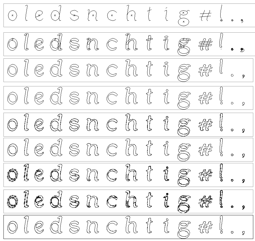
Fig 1.14 (Process work), (week 10, 25/11/2024)
Final typeface

Fig 1.14 (Final work), (week 10, 25/11/2024)
On week 11 we were task to insert our typeface into FontLab from
Illustrator. In order to do this I first make measurements of my font in
Illustrator and then insert it into Fontlab. Below are the measurements
taken.

Fig 1.15 (measurements), (week 11, 02/12/2024)
We were also given a chart on sidebearing measurements to be followed. I
edit this chart so that only the alphabet I used are shown to make it more
simple and easier on the eyes.

Fig 1.16 (Sidebearing chart), (week 11, 02/12/2024)
After that, I used the chart to adjust my alphabets, shown below is the
process on how I do it.

Fig 1.17 (Process work on FontLab), (week 11, 02/12/2024)
Creating poster
Then I exported the letter font so that it could be use on adobe
illustrator. After that I tried to create a poster using the letters. But
first I used Chatgpt in order to generate some sentences, since I only going
to use the letters o l e d s n c h t i g. I ended up with the sentence "The cold single light shines."

Fig 1.18 (Process work), (week 12, 09/12/2024)
Next I began my poster making in Adobe Illustrator. Below is my initial
idea.

Fig 1.19 (Initial idea), (week 12, 09/12/2024)
However after receiving feedback (week 12 feedback), Sir Vinod shows how to make a poster stands out and how spacing effects the poster. Below is the final poster

Fig 1.20 (final poster), (week 12, 09/12/2024)
FINAL SUBMISSION
Download font here:

Fig 1.20 (Screen grab), (week 12, 10/12/2024)
Fig 1.21 (Final type design, JPEG), (week 12, 10/12/2024)
Fig 1.22 (Final type design, PDF), (week 12, 10/12/2024)
google drive link: https://drive.google.com/file/d/1fMmuuaSMMGGZyftkTD7BV_9yRkvnWSs2/view?usp=drive_link

Fig 1.23 (Final poster design white, JPEG), (week 12, 10/12/2024)
Fig 1.24 (Final poster design, PDF), (week 12, 10/12/2024)

Fig 1.24 Final poster design black (JPEG), Week 12 (10/12/2024)
Fig 3.5 Final poster design black (PDF), Week 12 (10/12/2024)
Google drive link:
Feedback
Week 8: Independent learning week. No classes was
held.
Week 9:
- General feedback: Exclamation point stroke should be made bigger on the top and smaller at the bottom. The letter "s" should be smaller at top and bigger at the bottom (because our brain sees it that way, same size object looks bigger when put on top). All vertical and horizontal strokes should remain the same
- Specific feedback: My digitalization lacks of consistency, the letter "e", "s", and "c" should be made from the letter "o" so they will look alike. Same thing with vertical and horizontal strokes, I should reuse it for most letters instead of making new ones. Not only that, all stroke brush should remain the same for all the letters.
Week 10:
- General feedback: Comma should be roughly the height of 2 dots, a dot should be a slightly bigger than the dot on top of "i". The end of the comma should kind of resemble the end of the letter "s".
- Specific feedback: Sir. Vinod showed me that I could make imperfections by creating my own brush and applying it to the outline of the existing letters.
Week 11:
- General feedback: Sir. Vinod briefed us on our next task, and give specific feedbacks to each of us. Make sure to read all the instructions given.
- Specific feedback: The weight if the dot in the exclamation mark should be larger than the exclamation mark itself. This dot will later also be used for the full stop and comma.
Week 12:
- General feedback: When kerning in Fontlab make sure that you only kern when needed. Do not kern on all the letters. First, adjust the sidebearing using the guidelines and then, only kern on the ones needed.
- Specific feedback: The poster should create an impact, impact could be created by making the size bigger or repeating the words over and over again. A poster should stand out among others. On top of that the space between words are usually tighter to each others.
Week 13:
- General feedback: Sir. Vinod told us to use all the letters that we made into the poster, but it is ok not to use all the punctuation. He also briefed us on how to make the final e-portfolio compilation.
- Specific feedback: The poster is all alright, continue making the e-portfolio.
Reflections
Experience
Honestly, when I was working on this task I was quite confuse. I
didn't understand how to make my own writing style and I didn't
understand how to make a good digitalize version of it. But, with
every feedback that I receive I began to understand, and little by
little I added details to my writing style and at the end I actually
became satisfied with it.
Observation
I observe that although a font might look symmetrical, it's
actually not. I learned this through the letter dissection. On top
of that, there are no perfect circle within a letter, they are
made with combinations of circles, making an oval like
shape.
I also learn on how to make a poster interesting. Sir Vinod mentioned that a poster could stand out by making the words bigger or by repeating the words.
Findings
At the beginning I find it difficult to understand how to make a
good font. I was initially confuse between making my style
complicated or simple. I then ended up with a simple style and
along the way, I added details on it.
Further Reading

Fig 2.1 (The Fundamentals of Typography, by Gavin Ambrose/Paul Harris), (week 8, 14/11/2024)
Chapter 4
- Mistakes in a text: widows, orphans, hypos, rivers, and rags.
- Hyphenation: can help decrease the rivers of spaces in justified text
- Alignment: different alignment styles creates great impact on the overall aesthetic of the design. (some individual characters needs different or additional alignment when it is used in different cases, ex. bullets, hyphens, parentheses)
- Indentation: provide easy accessible starting point for readers
- Indexes: provide easy location of information
Chapter 5
- Hierarchy is the visual way to express the importance of different parts of the text using visual guide to organize it.

Fig 2.2 (hierarchy example), (week 12, 11/12/2024)
- The use of color is also important in typography as it could contribute to the overall design by creating hierarchy, contrast, definition and meaning to the text
- Types of printing:
- Surprint: tints of the same color in order to create texture.
- Overprint: when an ink is applied on top of another.
- Knockout printing: a gap left in the base color to allow other color to show through it.
Comments
Post a Comment