WEEK 6 (28/10/2024)
Angelique Svetlana Pekasa / 0377365
Digital photography and imaging / Bachelors Of Creative Media / Taylor's University
Task 2: Exercises
Table of contents
In this week's lecture we were introduced to 7 principles of poster design: emphasis, balance & alignment, contrast, repetition, proportion, movement, and white space. I've been experimenting a lot with white spaces as it is also greatly used in our typography class when designing a layout. Attached below are the screenshots of the slides given on the lecture.

Fig 1.1 (emphasis)

Fig 1.2 (balance and alignment)

Fig 1.3 (contrast)

Fig 1.4 (repetition)

Fig 1.5 (movement)
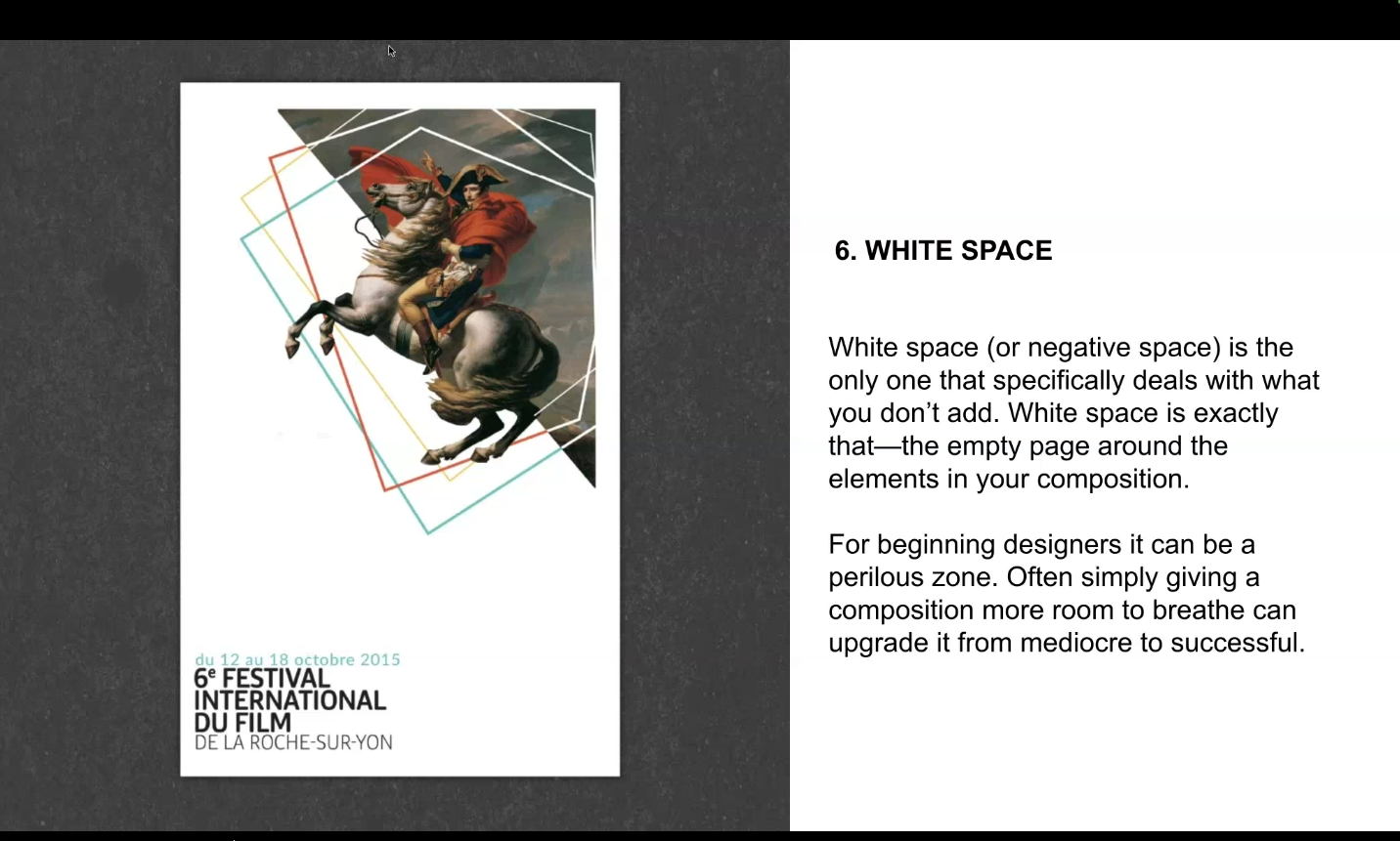
Fig 1.6 (white spaces)
Tutorial
Instructions:
Exercise 1
- OBJECTIVE: Turn B&W photo into COLOUR photo
- Download the image here: https://drive.google.com/file/d/1iYbFpDqdTjdHzkBpLWLkFwPJut6N8ItA/view?usp=sharing
- VIDEO TUTORIAL: https://youtu.be/DeGpKh6pMfk
Exercise 2
- OBJECTIVE: Recolouring B&W photo- Advanced level
- Demo video: https://youtu.be/Tye0ULqK9SQ
- Download images: https://drive.google.com/drive/folders/18lnIazWaZSUfBkzgWhSocbJAoLKEByI8?usp=sharing
Practical: Recoloring Black &White
Exercise 1
For this exercise I followed the tutorial given.
After seeing the results I felt like the hair color is too bright, so I changed it to brown using hue/saturation and using the brush tool I added strokes on the hair to add value to the hair.

Fig 2.1 (changing hue/saturation and adding brush strokes), (week 6, 28/10/2024)
Final outcome

Fig 2.2 (final outcome), (week 6, 28/10/2024)
Exercise 2
Part 1
In this exercise we were given a more complex tutorial to be followed. We were provided with 3 images, 1 black and white image to be edited, and 2 references for the hair and skin tone palette.


Fig 2.3 (left: b&w portrait, middle: hair color, right: skin color), (week 6, 29/10/2024)

I followed the instructions one by one and mask each layer. I also rasterize the layers for lips and earrings which is why the layer looked different from the others. I rasterize them so that I could manually edit them, as it is easier for me to edit some parts manually. Below is the results of all the layers that I masked and edit
.

Fig 2.4 (layers masked), (week 6, 29/10/2024)
FINAL OUTCOME

Fig 2.5 (final outcome), (week 6, 29/10/2024)
Part 2
First I search up 2 reference image on google to be use as a color palette, 1 for the face and the other for the hair.


Fig 2.3 (left: hair reference, right: face reference)
(Source: left; https://www.freepik.com/premium-ai-image/man-hair-style_156515123.htm,
right; https://static.vecteezy.com/system/resources/thumbnails/050/349/369/small/young-male-model-with-striking-blue-eyes-poses-against-neutral-background-photo.jpeg), (week 6, 30/10/2024)
Then I used the eye dropper tool to make the color palette for both the hair and the face, I also make sure that the sample size is 3 by 3 or 5 by 5 to get the average color of each shade.


Fig 2.4 (making the color palette), (week 6, 30/10/2024)


Fig 2.5 (masking the hair), (week 6, 30/10/2024)
Next I create a new solid color layer, pick the color from the palette made, and move the mask into that new solid solid color layer. Then adjust the layer into overlay. Repeat this process for the face, clothes, background, lips and eyes. Sometimes the layer could be adjusted to soft light, the opacity of the layer could be also decreased to make a better result, and color could be changed by adjusting the hue/saturation.


Fig 2.6 (coloring the hair), (week 6, 30/10/2024)


Fig 2.7 (coloring the face and changing the color using hue/saturation), (week 6, 30/10/2024)


Fig 2.8 (left: adding background color, right: adding clothes color), (week 6, 30/10/2024)

Fig 2.9 (adding lips and eye color), (week 6, 30/10/2024)
FINAL OUTCOME

Fig 2.10 (Final work), (week 6, 30/10/2024)
Reflections
Half way through this task I find myself in quite a situation where the layers that I masked merge into each other, this makes the colors merge and change from it's original colors. I find myself stuck for about an hour to solve it, but at the end I manually manage to make the layers very neat so that it won't merge with each other.
In addition to that, I also learned to manage all the layers and group them so that it will be easier to go back into it for revisions. Overall I fond this task informative, I think I would really use the materials learned here.
Comments
Post a Comment